Even though, at first glance, it may seem otherwise, gray has a rich palette of shades. With this, the color took over the streets, homes and corporate spaces. Far from being seen as dull, gray has become a wildcard in architecture and furniture, synonymous with balance, elegance and fluidity.
Because it is predominantly neutral, the tone can be combined with a multitude of other colors. Precisely because of its fluency between styles and colors, gray is increasingly leaving its role as a supporting character to position itself as the protagonist in various projects.
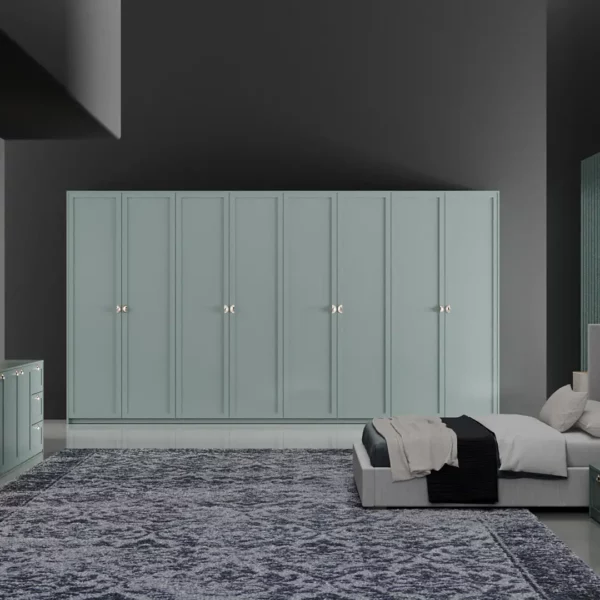
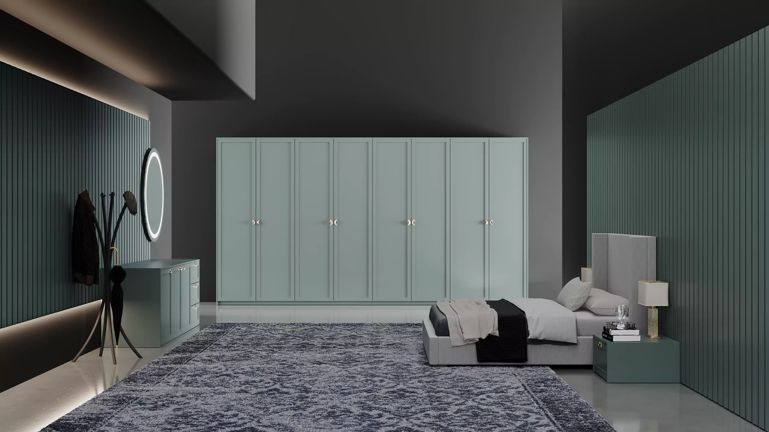
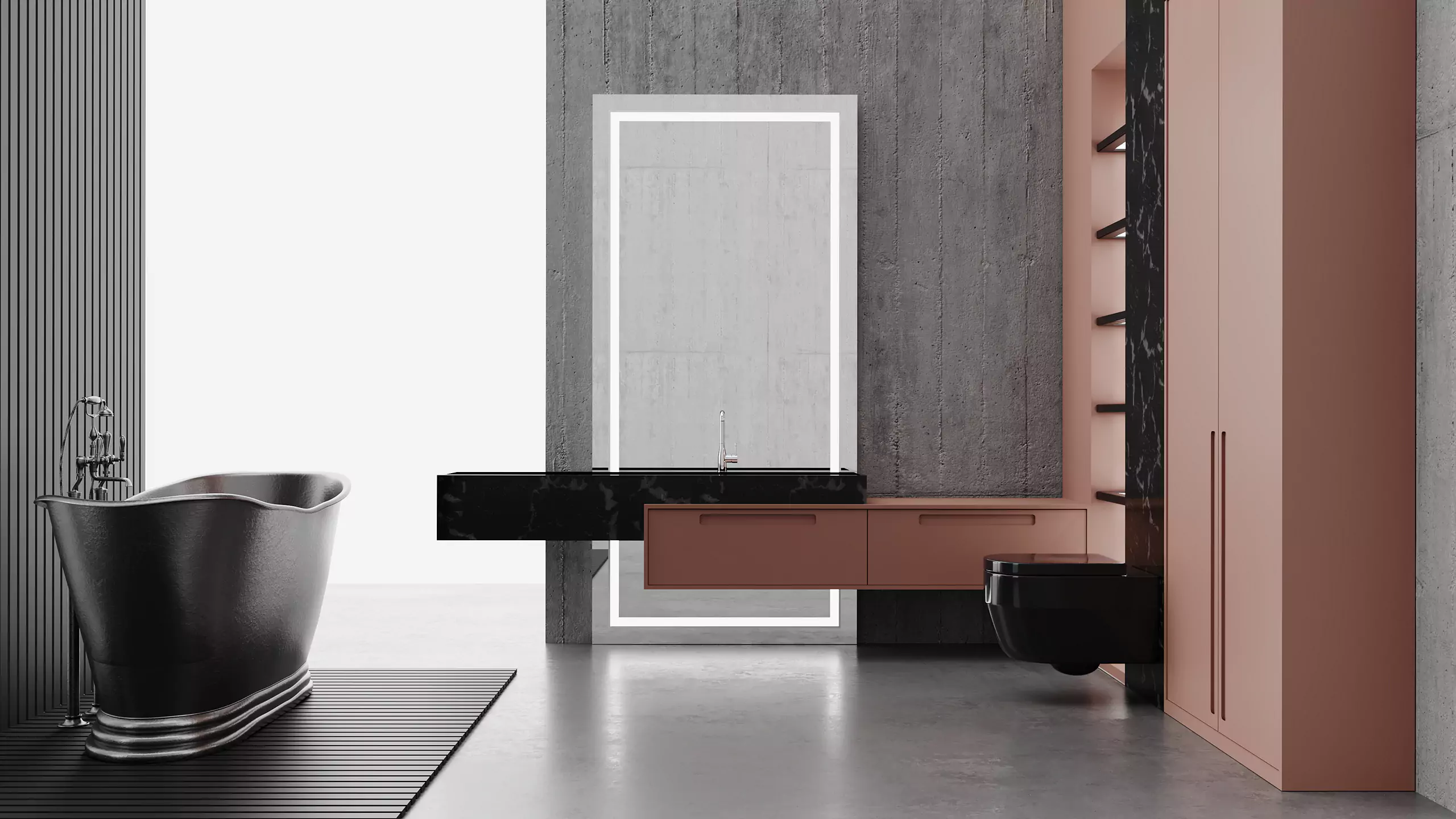
Neutral, but without going unnoticed, gray is a cold color that stands out among the warm tones, creating a balancing counterpoint. For those who like to color their home, but without exaggerating, gray is the ideal color for walls and furniture: there is no risk of it becoming tiring over time, something that often happens with intense colors.
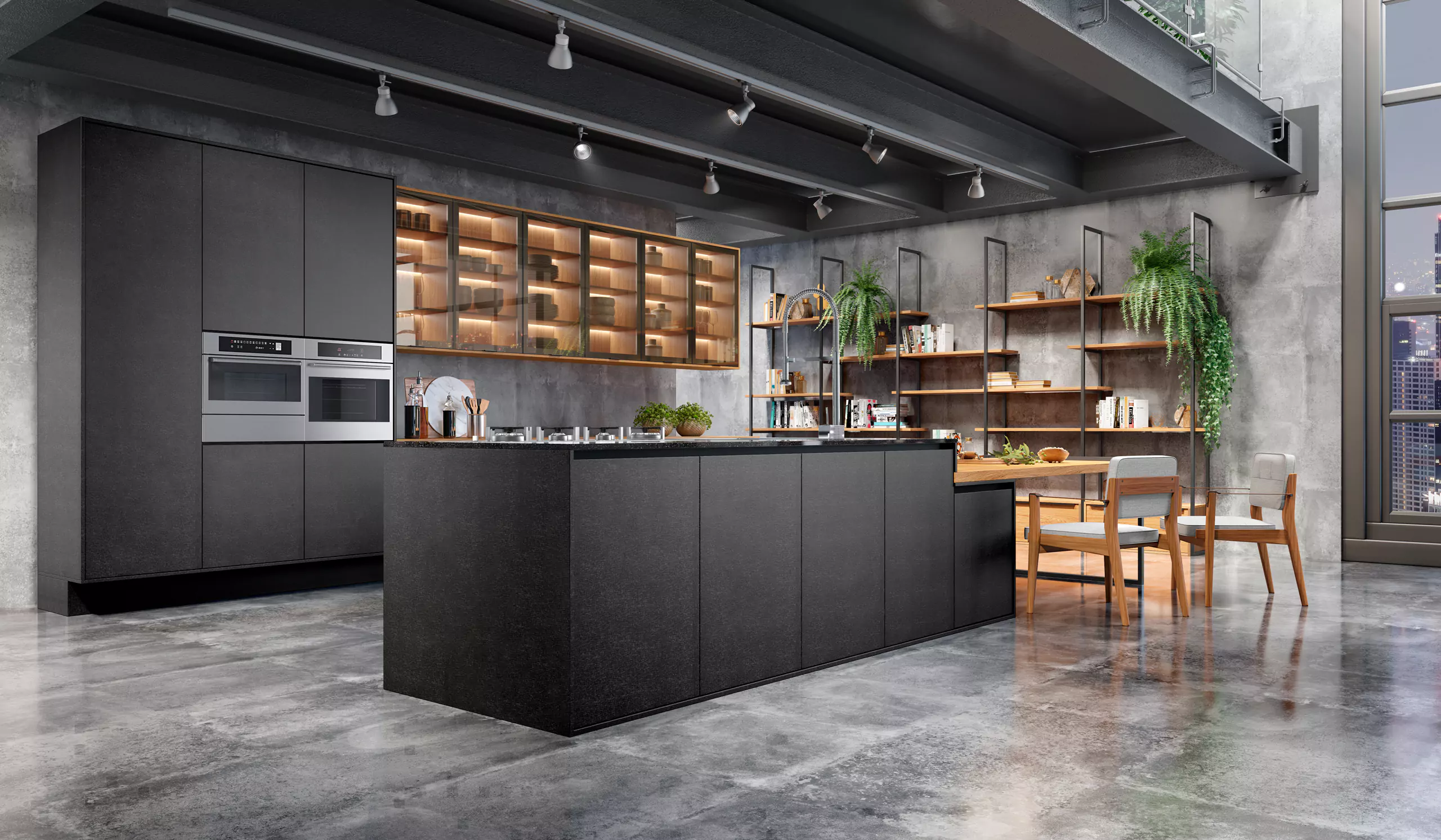
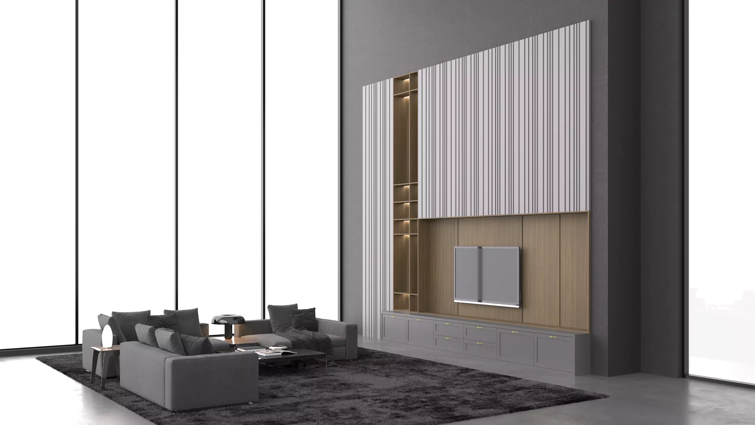
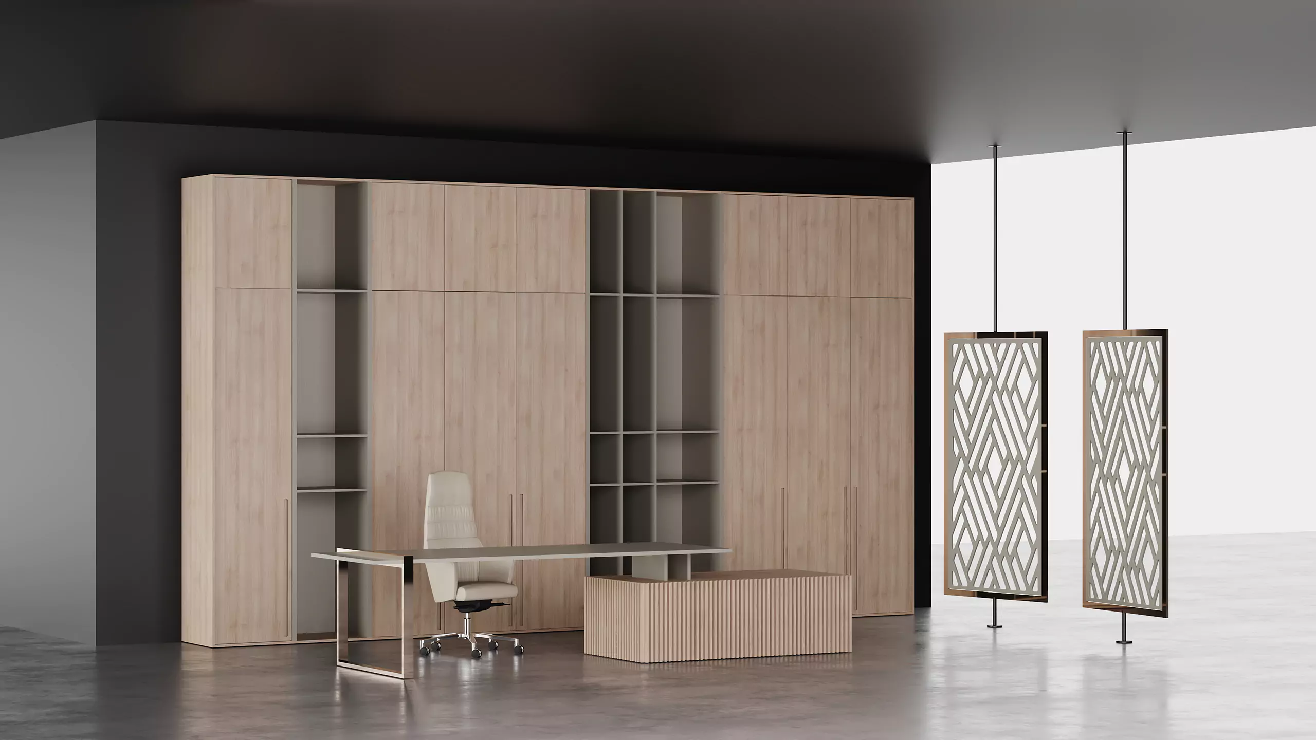
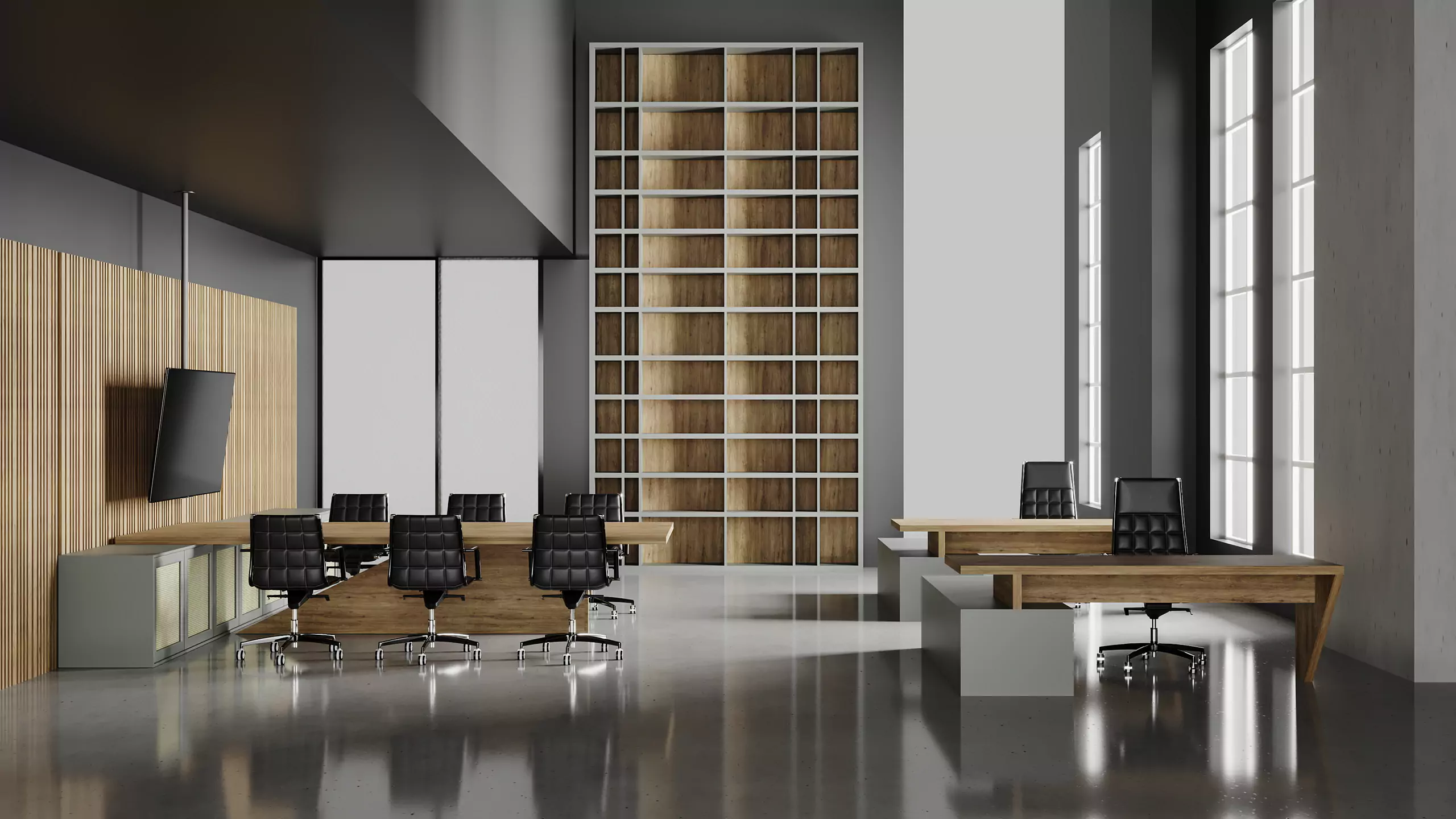
This is also why it is the ideal color to be applied to large surfaces, where strong tones can appear in details and decorative items. A palette of grays with different textures makes the furniture convey a feeling of sobriety, especially when combined with cold materials, such as glass, mirrors and metals. Environments built along these lines accommodate corporate spaces very well.
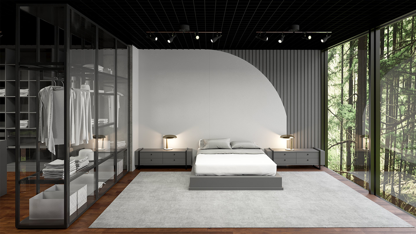
With great versatility and elegance, the application of gray can elevate projects to levels of extreme sophistication. With nuances that vary from the lightest to the darkest, perfect for combining with specific insertions of vibrant colors and without leaving out the combination with other neutral colors, it is no exaggeration to say that gray is a universal color.